On color and trends
I’m still working on the same quilts I’ve been working on since January, but because I’m committed to making them awesome, I’m taking my time and making sure that each element has a purpose. I’m also not used to working on so many quilts at once. I like that I can do whatever I have time for that day, but it is not great for my momentum on any one project.
I like to observe trends, but I try not to follow them in personal work unless it comes to me in an organic and natural way. (I used to write about marketing, and after consuming so much of it, I find myself rebelling against things that are marketed toward me. Or at least trying to be conscious of why I want something beyond what I’ve been told to do by people who stand to make money. But that’s a post for another day.) I thought it was very funny and a little fascinating that both of my current big quilt projects utilize the Pantone colors of the year, Rose Quartz and Serenity, pale pink and blue, respectively, in completely different ways.
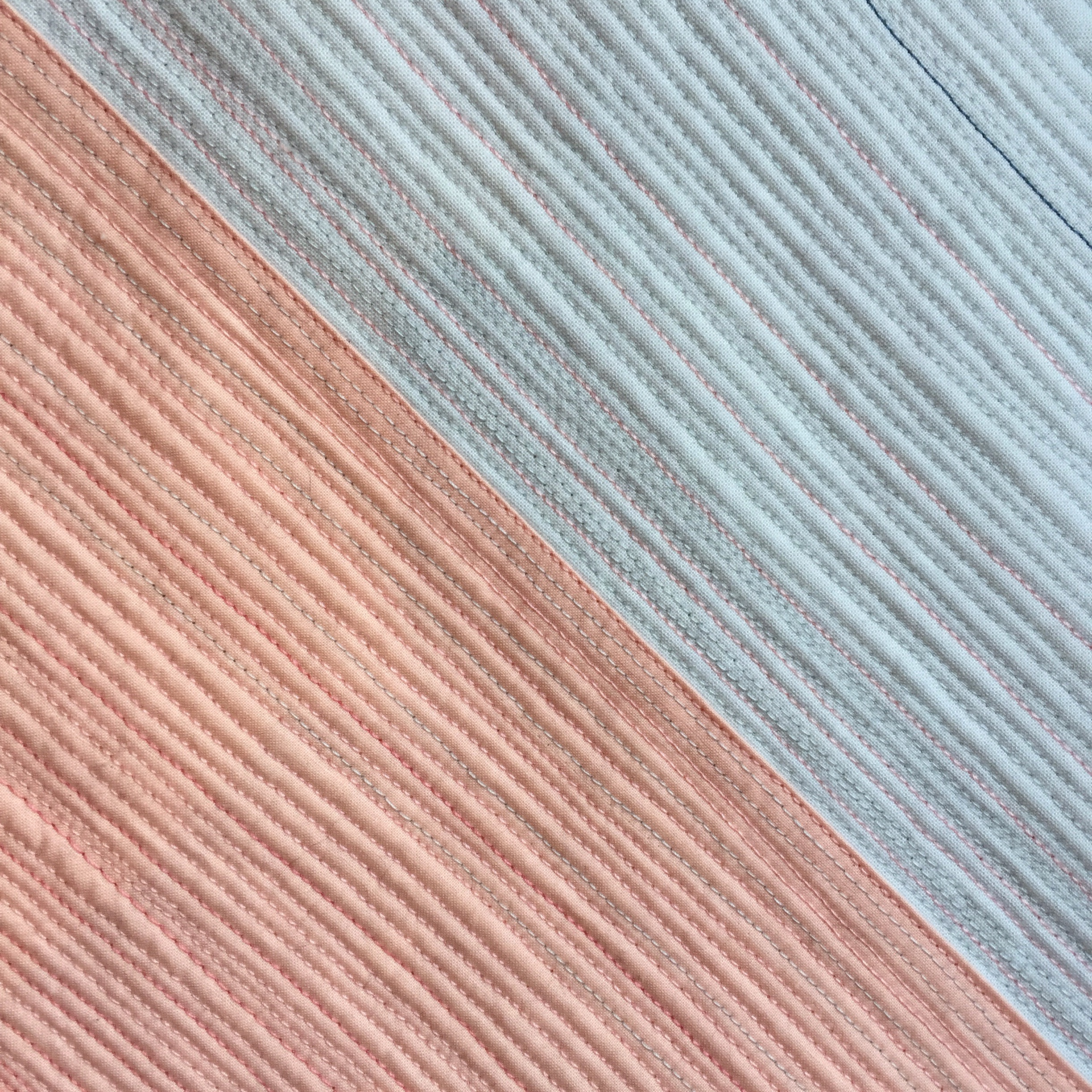
In my big stitch blocks, I’m using them as an alternative to white. I wanted to have big contrast between my background color, navy (Cirrus Ocean), and the lighter fabric, but I thought it would be nice too to have a little bit of variation in the hues of my light fabric. I chose Kona Sky, an almost-white pale blue, and Michael Miller Creamsicle, a pale peachy pink.

I’m working on another project that I am waiting to reveal, but it features a color gradation from warm to cool, so it starts in an orangey red and fades into a purpley dark blue. When I assembled my fabric, the Creamsicle and Sky ended up next to each other as the highest value of each of my warm and cool fabrics. It’s a very different effect, and looks very pretty pastel in this shot, but it will have a much different effect in the overall quilt, and I’m really happy about taking the matchstick quilting from one shade into the other.
I noticed that a lot of quilters had a negative reaction to the Pantone colors because of their pastel nature (so ’80s! they said), and I’m wondering a little if my choices were the result of some unconscious rebellion, subconscious suggestion, or unintentional coincidence. Either way, at the end of the day, we play with color, we make what we like, we observe the world around us, and it keeps spinning.

My workspace: tight quilting and plenty of threads to bury
I’m increasingly interested in exploring identity as it pertains to colors that I previously said I would never use. I remember saying that I would never want to make a quilt with pastels, just like I said I hated the color beige and then learned to love it in First Position. I have also been known to say that I am not a “pink person.” I still love the saturated in-between colors that I’ve always used, but it’s been revealing and expansive in my worldview to also explore the unlikely colors that will play well with them.

What colors have you found springing up unexpectedly in your sewing?
If you take a browse through my stash you will find all sorts of cool colors and tones, and yet lately I have found myself drawn to pink. I, too, have proclaimed that I am not a ‘pink’ person, but somehow the hue is seducing me….. Haven’t sewn with it yet, but my eye keeps resting on the color.
FWIW, the reason I don’t like the Pantone Colors of the Year is the horrific rhetoric that went with them. 🙂 The colors themselves aren’t bad!
I LOVEEeee your gradient quilt so much. The quilting is divine, love the way you got them to ombre!
For my personal challenge I’m trying to move away from aqua in everything. Especially aqua & lime. So I’ve been using more jade and mint recently which I never would have expected. Leads to more earthy palettes which is definitely a change of pace!
I’ve been forced to work with brown recently for a block swap. It’s a colour that has no home in any quilt I’ll ever make, and while it wasn’t too painful, it has served to reinforce the knowledge that my tastes strongly tend to clear, clean colours rather than muted, earthy shades. I’m curious about your matchstick quilting: does it not make the quilt quite stiff and un-drapey? It looks wonderful, but as I almost never make pieces intended to hang on the wall, I’m curious whether the finished result is soft enough for a bed quilt.
So I’m confused–you keep saying you are going to bury all of those threads but they looks like they’re at the edge of the quilt and would be cut off before binding. Am I just misunderstanding what is going on in the photos?
Hi Renee! The gray on the quilt is actually flannel backing fabric, not batting. I can see how it looks like it’s the edge of the quilt but there’s another 8 inches or so to the edge.
I feel bad that my thread burying is stressing people out! I’m up for it, though. I think this is the kind of quilt that takes awhile.
Hi Kate! The quilt is pretty stiff right now. I’m wondering how blocking will change it, but this is intended as a wall quilt. Thanks for your color thoughts– I would agree that I prefer clean to earthy shades. But I’m not ruling anything out! 😉
Yes! Isn’t that so interesting? It’s almost like the brain gets tired and wants something different and new and novel. I would love to read about the psychology of taste and preference. I’m sure it applied to all kinds of things. Thanks for your comment!
Oh Anne, I love your comment. And jade and mint, that sounds divine.
I thought it might be a bit too stiff for a bed. Thanks for confirming it 🙂
I had the same question as Renee, so I am even more curious about the full reveal. I have definitely seen a softening in my approach to using pink. I used to be very anti-pink, but now I have enjoyed using it in several projects lately.
Yes, I realize now that showing something that appears to be a problem is such a tease without a full reveal. Thanks to you and Renee both for hanging in!
Pingback: Episode 188: The Anyhoo Episode - The Off-Kilter Quilt
Pingback: Window #1 | Melanie Tuazon