The Poppstrong quilt
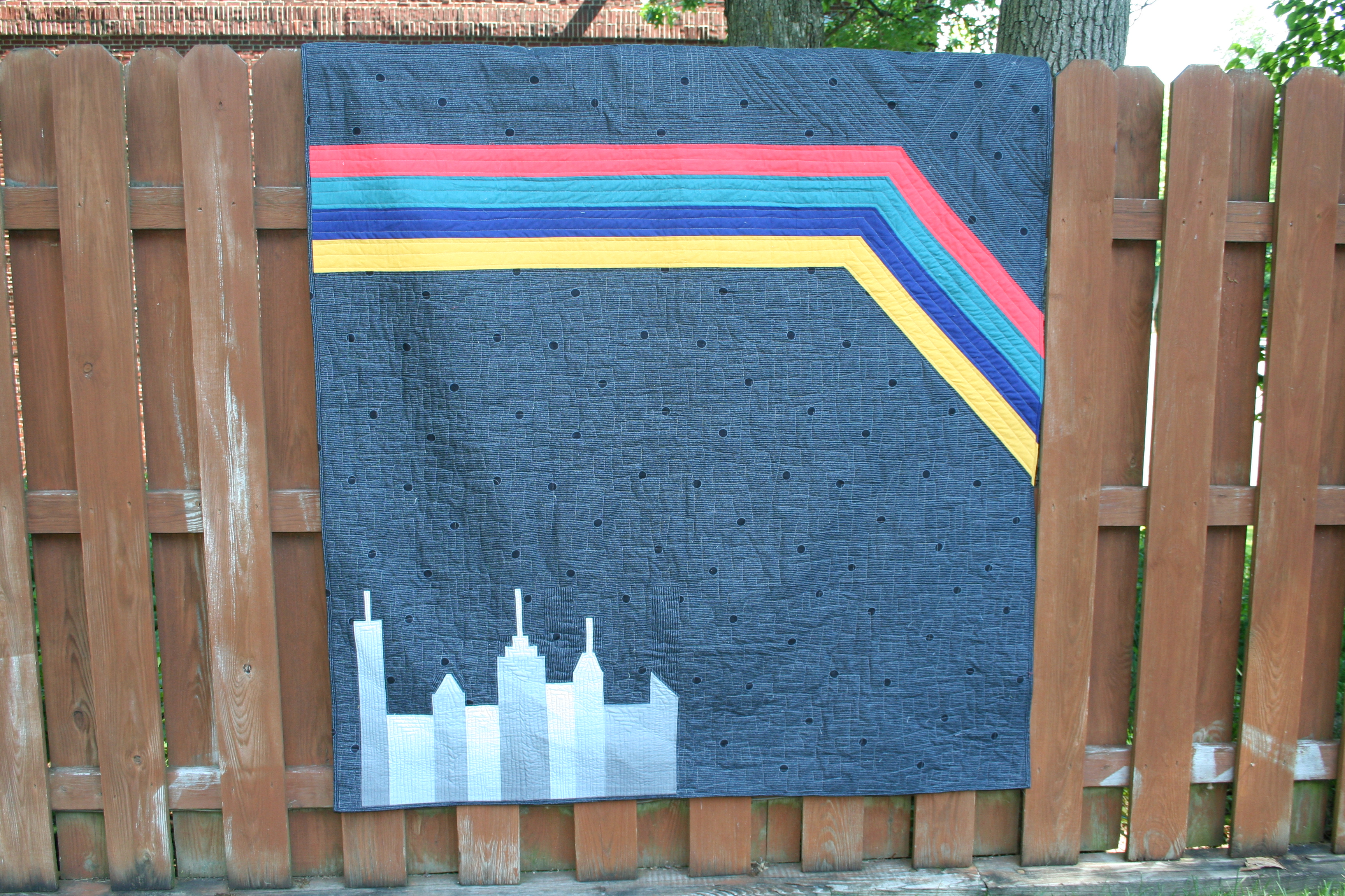
The idea for this quilt came about when I was thinking about designing something for a show. I usually design for a person, or let the fabric tell me what to do, but I just wanted to make a conceptual quilt. I wanted to make another skyline (previous skyline baby quilts are here and here), but not have it be the focus of the quilt. I wanted it to be an interesting detail. I also wanted to play more with angles, which I’ve been doing with the Technicolor quilt back and in Wyatt’s quilt. I wanted negative space, some minimalism, some architecture, a little color, a lot of drama. I envisioned a ribbon of hope over the city.

So I sketched it out, thought about colors, picked out fabric (Chicopee Ladder Dot and Simply Color Ombre with some bright solids) and showed it to my sister Liza. During the same visit, she had been telling me about a friend of hers, Mike Popp, who had been diagnosed with leukemia. At the time he was raising money for his treatment with a party, and Liza was attending the coming weekend (he still is fundraising online). Mike is a photographer and artist, and when Liza showed me his Instagram feed, I was even more inspired to make this quilt. His work is minimalist, geometric and gorgeous. I would make it with him in mind.

That’s when I knew that I wouldn’t make the quilt for the show. I would make it for Mike. Of course, Mike barely knows me, but I thought that if it isn’t his style, or if he doesn’t want it, then he can auction or sell it to raise some more money for the treatments he’s been having, which include chemo and a stem cell transplant (he updates his Tumblr pretty regularly about his treatment and feelings about it).

The quilt came together quickly, and I’m really happy with how it came out. It’s huge (for me), about 72″ wide and 86″ high. I wanted it to be big enough for an adult– I’m so used to making throws and baby quilts.
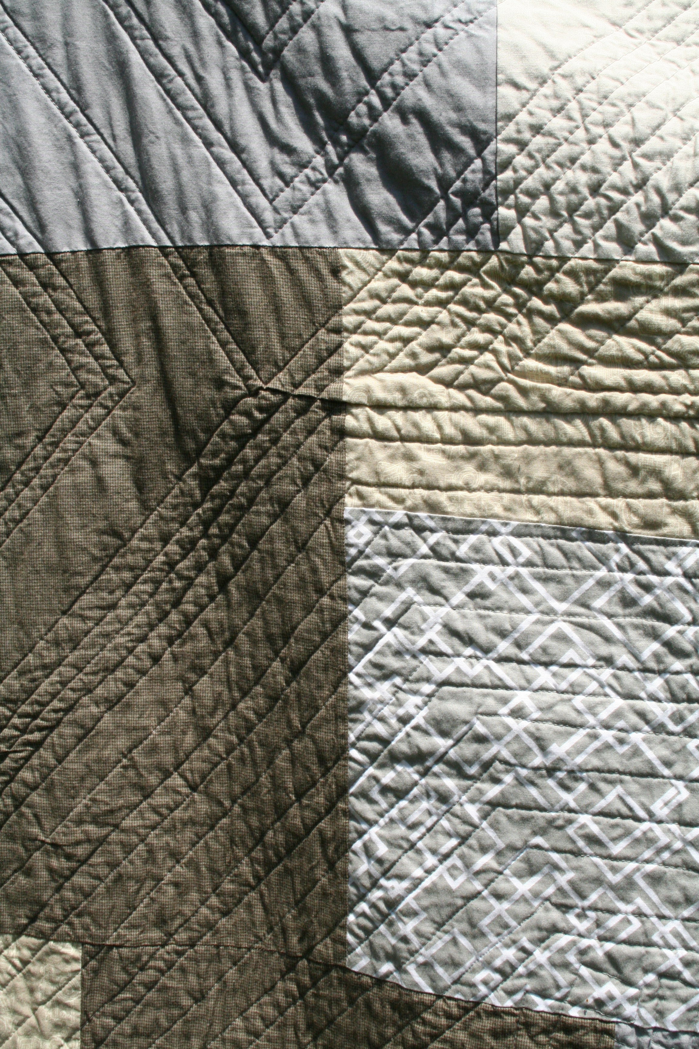
Check out the back. It’s my first time attempting text blocks, so they’re pretty square, but you get the message. The rest was improv pieced with shades of grey. The lighter tan-looking fabric has cameras on it, an ode to Mike’s photography.
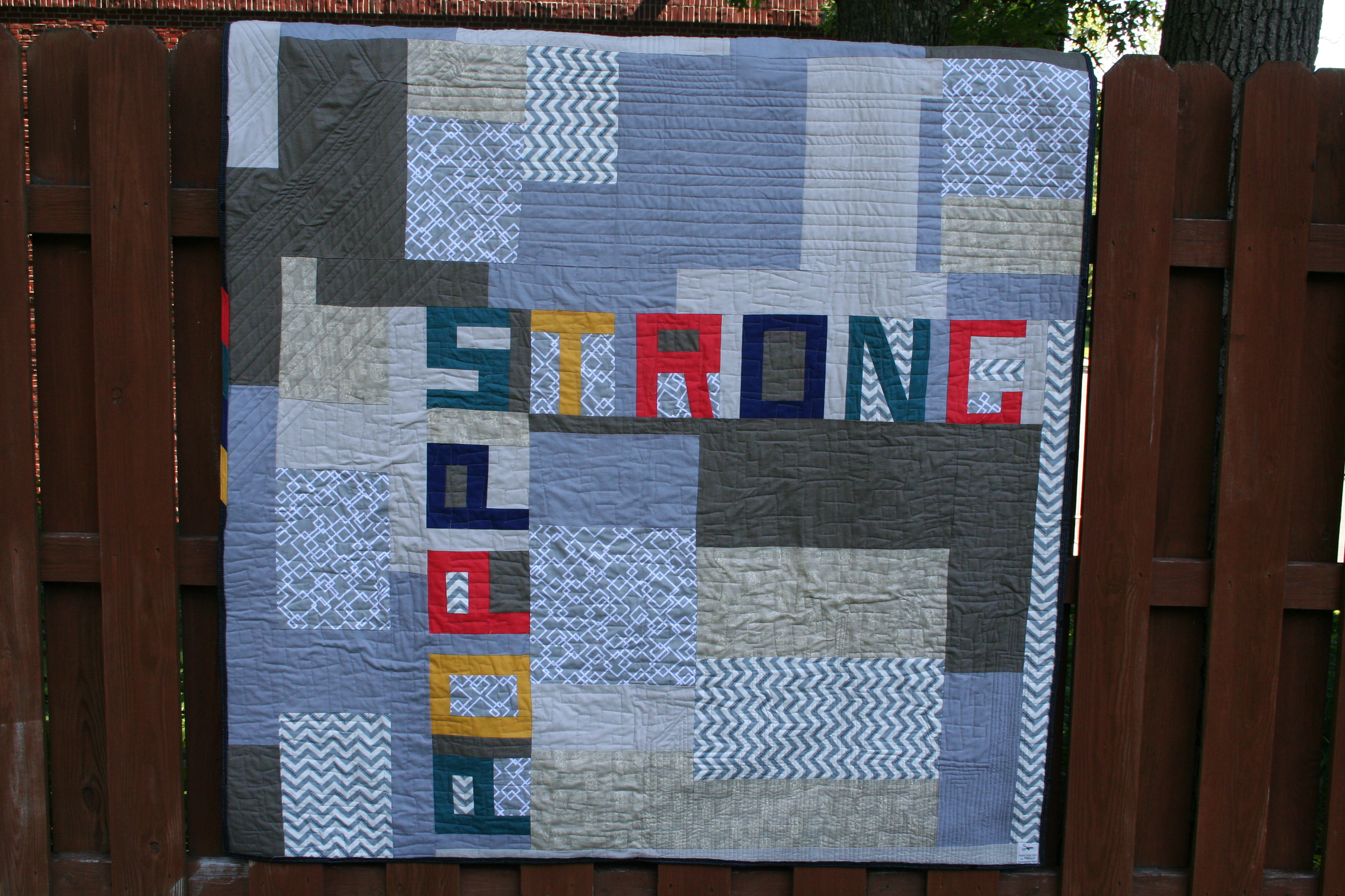
I used more of the black and gray for the binding to keep it simple. But I had a strip of stripes that was just the right size for binding, so I wrapped it around for some continuity. You can see it on the back on the left side above. I’m still a ways off from showing, but I’m happy just sending quilts for use and comfort.
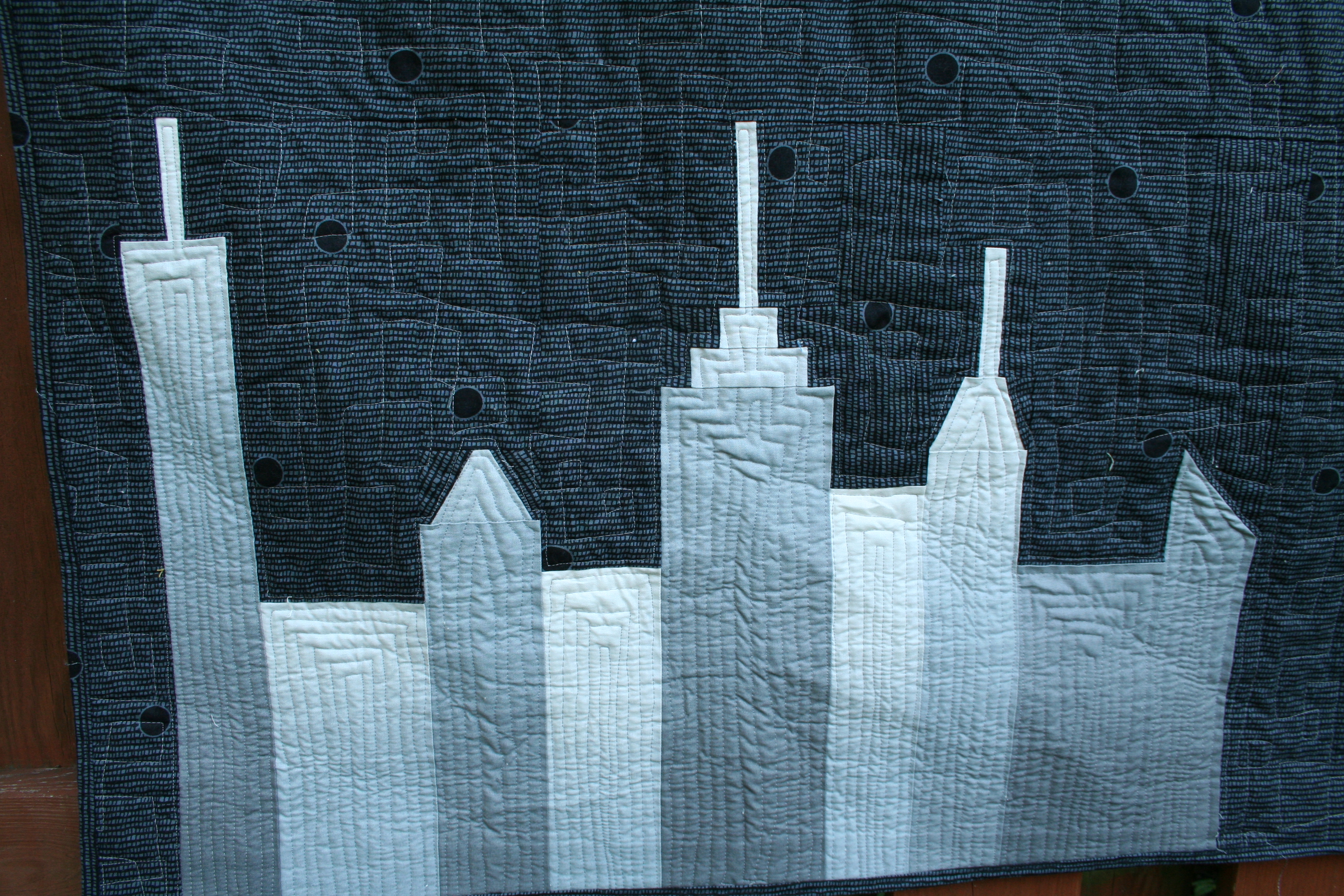
I free motion quilted some square loops in the negative space and tight echoes in the skyline. For the angles I used my walking foot.

Thanks again for coming by! It’s been so cool to meet new bloggers in the last few weeks. I always feel so inspired and motivated by the support I find on this site.
Gorgeous, Melanie!!! I am sure he will love it. I loved watching this come together and the love you stitched into it for Mike.
This quilt has been such a labor of love, the finished product is a work of art. For all Mike has been through, and the road he is still on, I hope he sees this quilt as a worthy companion. He is a strong young man who thrives on support like this. Beautiful job! Poppstrong!
The hubs and I are sitting in Dallas oohing and ahhing. This is amazing. My favorite of your quilts yet. The quilting is beautiful and it’s such a string quilt!!! Excellent.
Thanks so much.
And thank you for supporting the material budget for this quilt.
Thank you so much! Now go relax already! (Though looking at quilts is relaxing for me.)
That is amazing!!
Thanks, Darcy!
Wonderful quilt and lovely how you incorporated concepts in the design for Mike! How thoughtful and special 🙂
Thanks! It’s the little details that really motivate me to keep working on a quilt for weeks (or months) at a time.
This is an excellent quilt! I love it! You are very talented and very kind to throw yourself into a quilt for someone you barely know. Keep up the excellent work!
Thanks so much Maureen!
Pingback: Thankful Thursday | melintheattic
Omg I always loved this quilt and didn’t realize it was you! ❤
Oh my gosh that is the best compliment! Thank you!
Pingback: Peek Obsession | melintheattic
Pingback: Colour Blog series – Yellow | Melanie Tuazon