Green and Navy, volume and value
What a week! It started with the birth of my new nephew, a week early. When I went to visit him in Manhattan on Monday, I knew I was behind on his quilt anyway, even if he had been born on his due date. My sister had requested green, and luckily I am LOVING saturated greens right now, especially shades of emerald and lime. I planned to re-make “You Are My Sunshine” with greens and navy, mostly inspired by the lily pad prints from Rae Hokstra’s Lotus Pond collection for Cloud 9 Fabrics.
This is as much as I had done as of the day of the little one’s birth:  One 12.5″ block and a whole lot of 6.5″ squares. After Monday’s snuggle with him (I posted pictures of his scrumptious cheeks on Instagram), I needed to get to work, so I cut the rest of the curved pieces that very afternoon with my Drunkard’s Path rulers from Marti Mitchell.
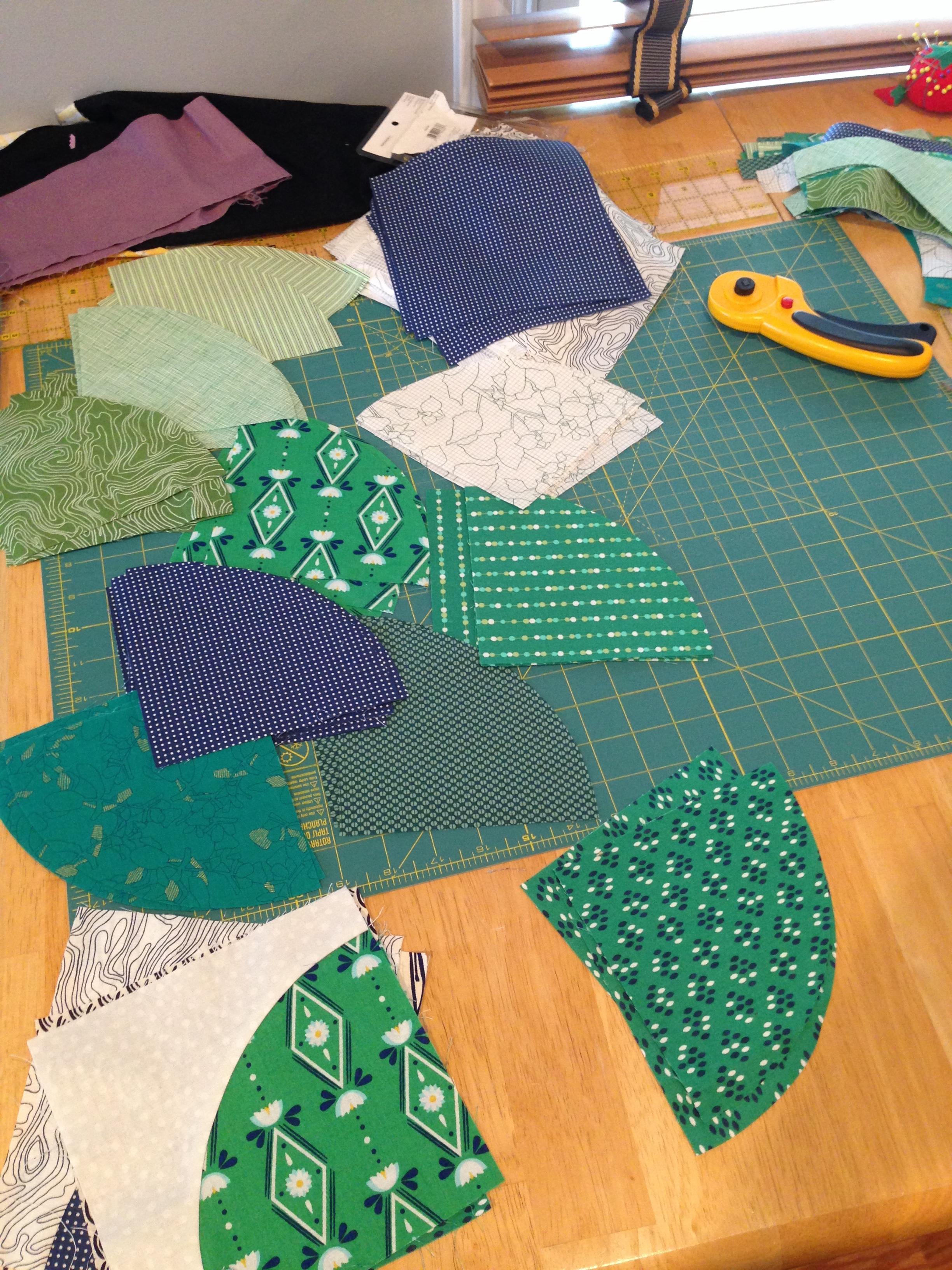
The plan was for low-volume navy and white as the background and all different shades of green and navy in the circles. I did try out some low-volume green (see the white wedges of Botanics next to the rotary cutter), but they didn’t work the same effect. Some of my “low volumes” were really just navy prints on white or ivory background. It was an excellent exercise in value and set rules for layout.
For reference, the greens I used are from some of my favorite collections– Lotus Pond, Color Me Happy, Architextures, Botanics, Florence, and Simply Color by Anna Maria Horner. The background fabrics are Kona Bone, Kona White, Dear Stella dots, Architextures, Koi, and Meadow. The navy is not true navy, but white dots on blue from Color Me Happy. I couldn’t resist the polka dots, and they provide just enough drama but not too much.
I pieced on Tuesday and Wednesday using glue basting, which I had read about a lot lately. I used a glue stick instead of pins, and the piecing went so fast! (Except for that one block I thought I sewed, but just glued and pressed. Gah.)
I got the top fully assembled yesterday:
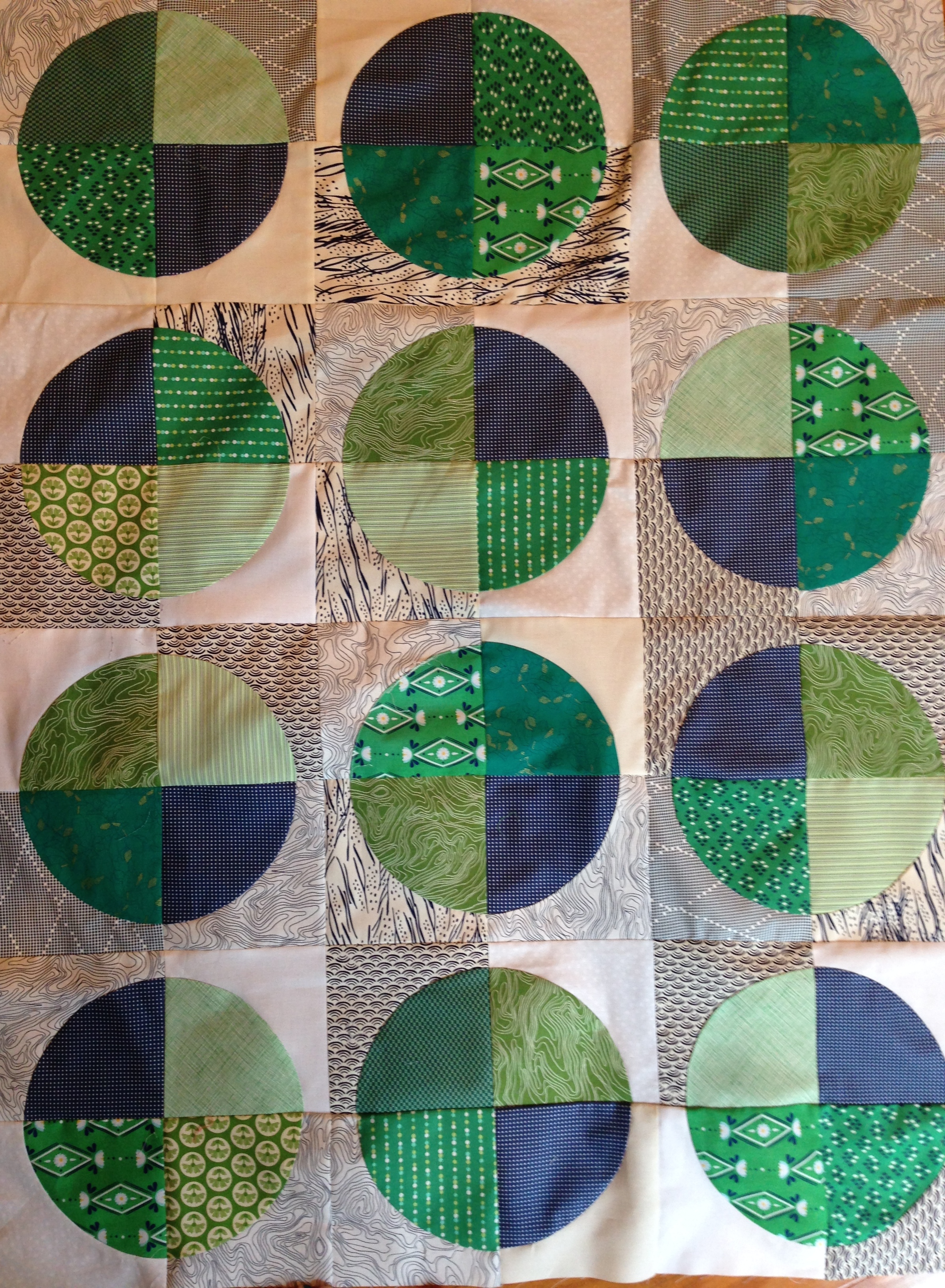 (This photo was taken quickly in odd light because I had to run to Rock Paper Scissors to get backing and batting before the weekend.)
I like how the greens with different value add a little depth, as do the varying prints in the background fabric.
I don’t think it will be done in time for our visit to Brooklyn tomorrow– I have some fun plans for the back. But I’m pleased with how this quilt is shaping up. Hang tight, little man!
Love it! I plan on doing the wedding quilt top in these colors so I may ask your opinion as I get closer! And congrats on that little nephew!!!!
Looking great – I love the contrast with the green/navy and low volume background.
I love it. Great design and play with color value. The blue is perfect with the green. I like that one all green circle. Great!!
These colors are great! But the prints that touch make me twitch a little… I guess I’m a little more neurotic than I’d like to admit. 😀 Oh, and I’m going to have to look into glue basting with a glue stick — I’ve only ever seen it done with ‘liquid’ glue.
Pingback: Mason’s quilt | melintheattic